Having a landing page that performs well is extremely important if you want to gain more clients for your contracting business. But crafting high-converting contractor landing pages is not easy. If you want to know how to get the most out of your landing page, we’ve put together a list of tips that can help you achieve that.
What Is a Landing Page?
Your landing page is where the conversion process takes place. It’s a standalone web page focused on a particular service for contractors. It has only one purpose: to convert users into customers.
Landing pages go hand in hand with advertising campaigns, so if a user from Google or Facebook sees your ad and clicks on the Call-To-Action, they’re directed straight to your landing page.
To have a high-converting landing page you can improve its basic structure with different tactics. This means homeowners will be nudged into becoming your clients without even realizing it. Here’s how:
1. Keep The Ad To Landing Page Consistency
The link between your ad and the landing page is very important. Most users arrive on your page after following an ad that matches their search query.
In order to satisfy user intent, it’s essential to have an alignment between that ad and the landing page. The user will be confused if you have a pond repair business and you’re only talking about how beautiful ponds are in the summer. You need to discuss more simple aspects of the service itself – such as what it takes to repair a pond.
Make sure the content across your campaign doesn’t change. When there’s a big disconnect between the ad and your landing page, the user will be confused and will probably leave your page immediately.
2. Lead With Unique Selling Points ( USPs )
The first time users have contact with your company they are usually hesitant to commit to anything. Your job is to need to change their minds quickly. The fastest way to do that is to offer benefits that can make your company stand out from the competition.
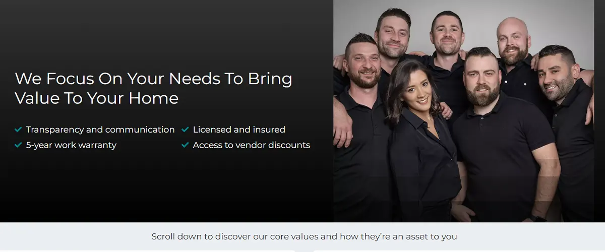
USPs are an effective marketing strategy for all contracting companies. They help users identify your business as a reliable and professional resource they can benefit from. It’s a specific proposition that places you above your competition. This means you have to go beyond generic statements like “we have high-quality craftsmanship”.
For instance, if your local business has been running for a long time by industry standards, you can advertise that. Or if you run a remodeling company that has won a prize in your local community, be sure to highlight it.

3. Maintain A Clean Page Design
The way your page looks is critical. If the design of your landing page doesn’t flow or doesn’t look the part, the visitor is probably going to leave. A landing page needs to have a smooth and professional look. Here are some ways you can achieve that:
- A consistent color scheme across the page
- Plenty of white space around the text
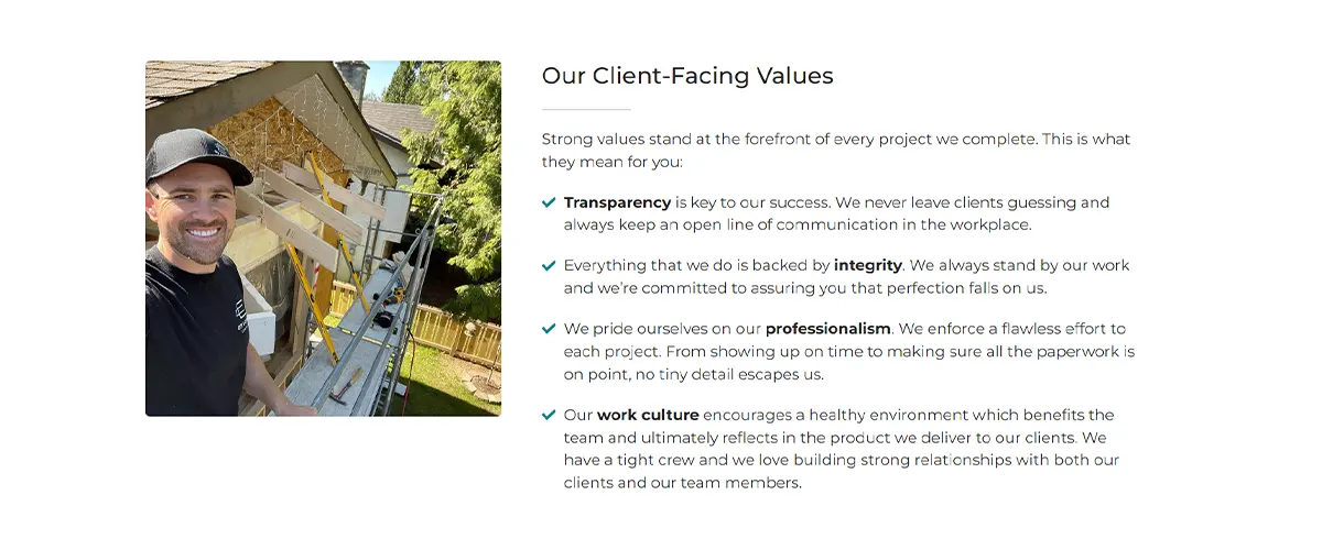
- Attractive and high-quality images and videos
- Headlines and CTA’s that pop off the page
- Keeping only elements that support the user’s journey
Since your user’s attention span is short, simplicity is key. Anything that slows down the reader’s ability to comprehend the flow and content of your landing page will reduce the conversion rate.
Remember: The only purpose of a landing page is to get your users to reach and click the Call-To-Action and submit their details!

4. Make Sure You Use Clear Copy
When it comes to writing flowing on the page, less is usually more. You don’t want to confuse your user with long and complex sentences. Keep the writing on your page engaging, professional, and to the point. If you’re looking for a tool to help you achieve this, Hemingway Editor is a great place to start.
Use copy that speaks directly to your ideal client. In copywriting this is called Voice-Of-Customer writing and it’s a way of relating to your reader, without using fancy terminology.
When you can articulate the prospects’ needs and wants, you’re creating a positive emotional reaction in their psychology. And when they get the idea that you understand how they feel, a connection is created. That connection in return builds the trust needed to give you their details and move the relationship forward.
5. Include Social Proof Elements
One of the main reasons homeowners hesitate to submit a quote request is the uncertainty that you can deliver on your promises. You can easily eliminate this anxiety by including social proof elements on your page.
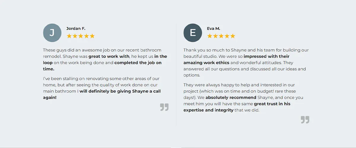
We’ve seen that homeowners are more likely to give you their details if they believe that others have also done so and were happy with their experience. In that sense, be sure to add testimonials from past customers that highlight the benefits of choosing you as a contractor.
Certifications are another great way to assure homeowners of your company’s value. You’ll earn their trust by convincing them you can handle their project with care and professionalism.

6. Use Branded Visual Content
Customize your page with media content that highlights the company’s value. You can make your user stay longer on the page by incorporating images and videos that build trust upfront.
First, a featured image representing the brand is crucial to any landing page. It sets the tone for the entire user experience. Since images are one of the first things most users see, they have the potential to shape the visitors’ impression of your brand before they get a chance to read the actual content. So make sure you have a high-quality featured image that is relevant to the service provided.
You can also use a video. Customers love to see who’s behind the wheel and it’s a great way to showcase who you are and build trust fast. A good video is short and grabs attention in the first five seconds. Build rapport by telling homeowners what wins they can expect from choosing your services.
7. Make Your Page Mobile-Friendly
There is no secret that most people spend a lot of time on their phones. One study found that 61% of visits to U.S. websites in 2020 came from mobile devices alone. Not only that, but Google started penalizing websites that aren’t built to work on phones. So what does it mean if your landing pages aren’t mobile-friendly?
- You will not appear high in search engine results
- You will keep paying for ads without seeing results
- Users won’t stick around on your page because of poor visual quality
8. Use An Easy-To-Follow Contact Form
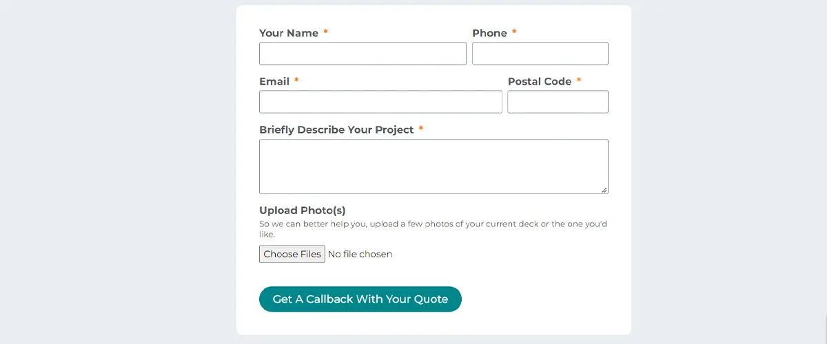
The key to making any landing page work effectively is keeping the structure simple and clear. And this is especially important for contact forms. Since a user’s attention span is short, complicated forms will make them less likely to give out their information. They’ll see it as a difficult process and will probably give up before you have a chance to convert them.
Keep your contact forms minimal by only asking about the things you absolutely need. If you are a contractor, that means you should try to obtain the prospect’s name, phone number, email, and a brief description of their remodeling needs.
You can also include a friendly form submission button that can read something like “Let’s Talk About Your Project.” This is a great way to “humanize” your business online and show them it’s a person-to-person relationship.

Get Help Creating Effective Contractor Landing Pages
If you’re ready to update your online marketing strategy, we’ve got you covered. We’ve helped over 160 contractors take their business to the next level.
Here, at Contracting Empire, we’ve developed a proven formula with an easy-to-remember acronym ( M.E.E.T.U.P. ) that will ensure your landing pages will always perform.
With our landing page services, you can start converting prospects and gain high-quality clients for your contracting business sooner than you think.
Want to see how contractors are slowly moving away from word of mouth to a more independent and efficient lead generation system? Watch our Market Domination Blueprint, specifically designed for U.S. contractors.
