Your website is the heart of your digital marketing campaign. From functionality to appearance – every detail matters. Did you know that 48% of people say that web design is the number one factor determining a business’s credibility? In most cases, how your website looks is the first thing that most users notice.
Your contractor web design affects the amount of traffic on your site and whether homeowners will stick around enough to become your clients or not. In this article, we’ll go over some of the best practices that will transform your website into a tool that will grow your contracting business.
1. Focus On User Experience
Better Readability
No matter the amount of information you have on your website, most of your efforts will be wasted if the user has trouble reading it. Make sure there is a big difference between your text and the background colors, and don’t forget to choose a font that’s easy to read.
Fast Loading Speed
Utilize Empty Space
These are just a few examples of how you can create a user-friendly website that homeowners can enjoy exploring. There are plenty of other tips and tricks that help you achieve the perfect web design.
2. Choose Colors that Represent Your Brand
When choosing colors, stick to a maximum of four. One will be the main color on your website, along with two accent colors and a font color.
Establish a style guide and stick to it. Use colors consistently in the same place and on every page. When your site has a cohesive look, homeowners are more likely to trust your brand.
3. Go For A Simple Navigation System
The mark of a good contractor web design is its ability to make things as easy as possible for the user. If they have a hard time accessing certain details, they are more likely to bounce, and you will miss your chance of gaining a new client.
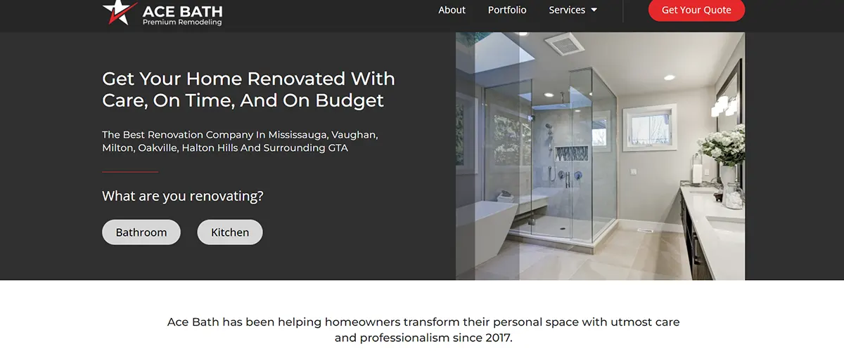
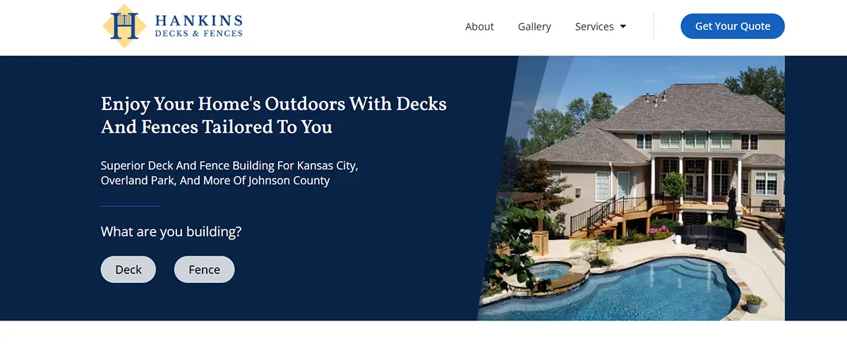
Our best advice for you is to have a simple navigation bar at the top of the page with straightforward categories that homeowners can easily access. Your navigation system should have clear headings divided by the page’s content ( About, Gallery, Services, etc.)
You can even use a dropdown menu below the buttons that require more categories. If you’re doing home remodeling, the “Service” button can be divided into your specific services, such as “Bathroom Remodeling” or “Kitchen Remodeling.”
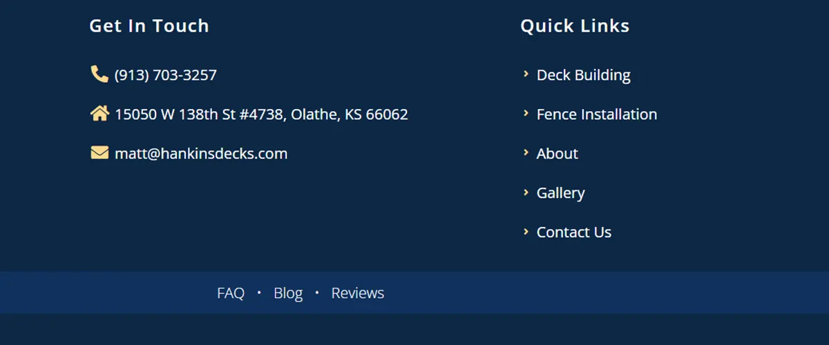
You can even include helpful links in your footer. If homeowners end up at the bottom of your page, they should have an option of browsing further. Whatever navigation system you opt for, make sure the categories are logically organized so that users can quickly determine where to click for the information they need.
4. Add Trust Elements To Boost Credibility
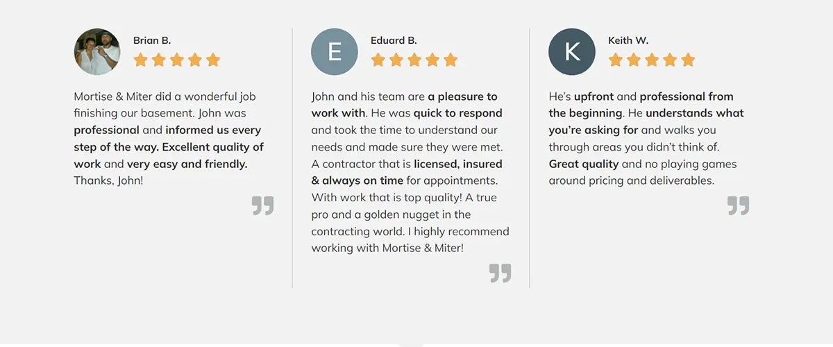
If you want your readers to turn into customers, you need to get them to trust your company. A great way to build that trust is by sharing the experience that other homeowners had working with you. You can integrate testimonials as part of your website’s design and make your content flow smoothly.
5. Incorporate Engaging Visual Elements
If a homeowner visits your website and only sees never-ending blocks of text, they will leave in a heartbeat. One of the most basic web design practices is adding visuals. They help break the content on your website so that readers can digest the information.
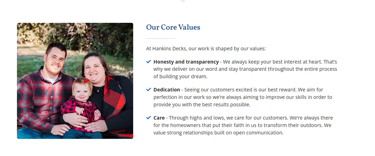
You can incorporate images that align with your services and overall design style. And if you can, make sure they’re authentic. Many contractors use stock photos, but homeowners love seeing real results from past projects. You can even include pictures of yourself, your team and even your family. This way, your readers will connect with you faster and have a more personal experience on your website.
Another way to boost conversion is by using videos on your website. According to some stats, 96% of people have watched an explainer video to learn more about a product or service, and 64% of consumers make a purchase after watching branded social videos. You can use a video to showcase your services and talk about your company in an informal way. Homeowners will then feel closer to your brand and trust your level of commitment to their needs.
6. Craft Powerful Call-To-Action ( CTA ) Buttons On Every Page
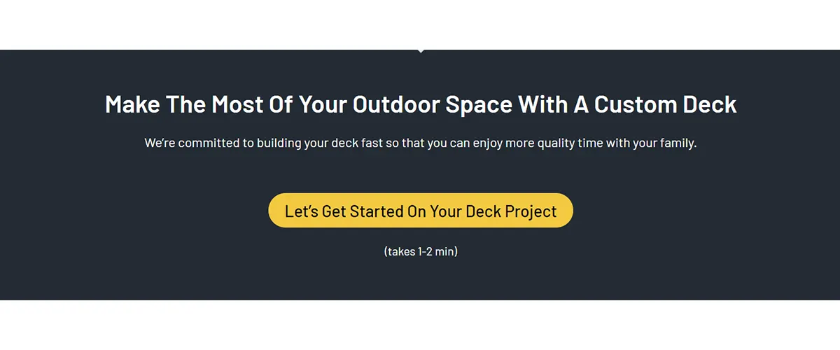
Your homepage shouldn’t be the only one that hosts a Call-To-Action at the bottom of the page. Every page should move homeowners toward becoming your clients. A powerful CTA is the last step of a carefully-planned design that prompts them to take action.
Plus, users shouldn’t have to go back to your homepage if they want to get a quote from you. This way, no matter where a homeowner is on your website, they can quickly submit their details and take the next step in becoming your customer. Here’s how you can make your CTA buttons engaging:
Have A Quality Design That Matches Your Brand
If you’re ready to get results from a web design that holds the user’s attention, we’ve got you covered. We’ve helped over 150 contractors like you upgrade their online marketing strategy with websites that represent their company and vision.
With our services, you can start converting prospects and gain high-quality clients for your contracting business sooner than you think.

Anamaria Coteneanu, Copywriter @ Contracting Empire
By day, Ana is a passionate writer with a knack for understanding what makes your audience tick. She loves delivering compelling copy that showcases your brand’s value and helps your business succeed.
During off hours, she enjoys hosting get-togethers for her friends, diving deep into the art of cocktail-making, and traveling as far as her feet can take her.

